8 Creative Ways to Design a Coffee Mug Logo for Your Brand
Picture this: It’s Monday morning, and your team member reaches for their favorite coffee mug—the one with your company logo. As they take that first sip, they’re not just drinking coffee; they’re connecting with your brand story, values, and identity. In 2026, coffee mug logos have evolved far beyond simple text placement. They’ve become powerful branding tools that create emotional connections and lasting impressions.
Whether you’re a startup looking to establish your presence or an established business wanting to refresh your promotional materials, understanding the 8 creative ways to design a coffee mug logo for your brand can transform ordinary drinkware into memorable brand ambassadors. From embracing the latest “toasty logo” trends to incorporating interactive storytelling elements, these strategies will help you create designs that resonate with your audience and stand out in today’s competitive marketplace.
Key Takeaways
- Prioritize clarity and warmth over overly polished designs—consumers prefer logos with story and selective details that feel authentic
- Embrace “toasty logo” styling with rounded letterforms, soft curves, and earthy color palettes like oat, terracotta, and sage
- Use the “stamp & seal” approach with hero symbols that tell your brand story quickly and effectively
- Test black-and-white versions first to ensure versatility across different printing methods and applications
- Balance professional branding with interactive storytelling elements to create emotional connections
Understanding Modern Coffee Mug Logo Design Trends
The landscape of coffee mug logo design has dramatically shifted in 2026. Gone are the days when a simple company name sufficed. Today’s successful mug logos tell stories, evoke emotions, and create memorable brand experiences that extend far beyond the office break room.
Modern consumers crave authenticity over perfection. This means your logo should feel warm, approachable, and genuinely representative of your brand values. The most effective designs strike a balance between professional credibility and human connection, making your brand feel accessible rather than corporate and distant.
Current design trends emphasize clarity over complexity. Your logo needs to work across various sizes and printing methods, from large conference room displays to small promotional items. This requirement has led many brands to adopt simplified, iconic designs that maintain their impact whether they’re printed on a 15-ounce mug or a business card.
The rise of remote work culture has also influenced mug logo design. With more employees working from home, branded mugs serve as important touchpoints that maintain company culture and connection. This has elevated the importance of creating designs that people genuinely want to use in their personal spaces.
The Foundation: Planning Your Coffee Mug Logo Strategy
Before diving into the 8 creative ways to design a coffee mug logo for your brand, it’s essential to establish a solid strategic foundation. Your logo design process should begin with a clear understanding of your brand identity, target audience, and intended use cases.
Start by defining your brand personality. Are you a tech startup that values innovation and disruption? A family-owned business that emphasizes tradition and trust? Or perhaps a creative agency that celebrates boldness and originality? Your mug logo should reflect these core characteristics while remaining versatile enough for various applications.
Consider your target audience demographics and preferences. Millennials and Gen Z consumers often gravitate toward brands that demonstrate authenticity and social consciousness, while corporate clients might prefer more traditional, professional aesthetics. Understanding these preferences will guide your color choices, typography, and overall design approach.
Budget and timeline considerations also play crucial roles in your design strategy. Different printing methods and design complexities come with varying costs and production times. Planning these factors upfront will help you make informed decisions about which creative approaches align with your resources and goals.
1. Embrace the “Toasty Logo” Trend with Rounded Typography
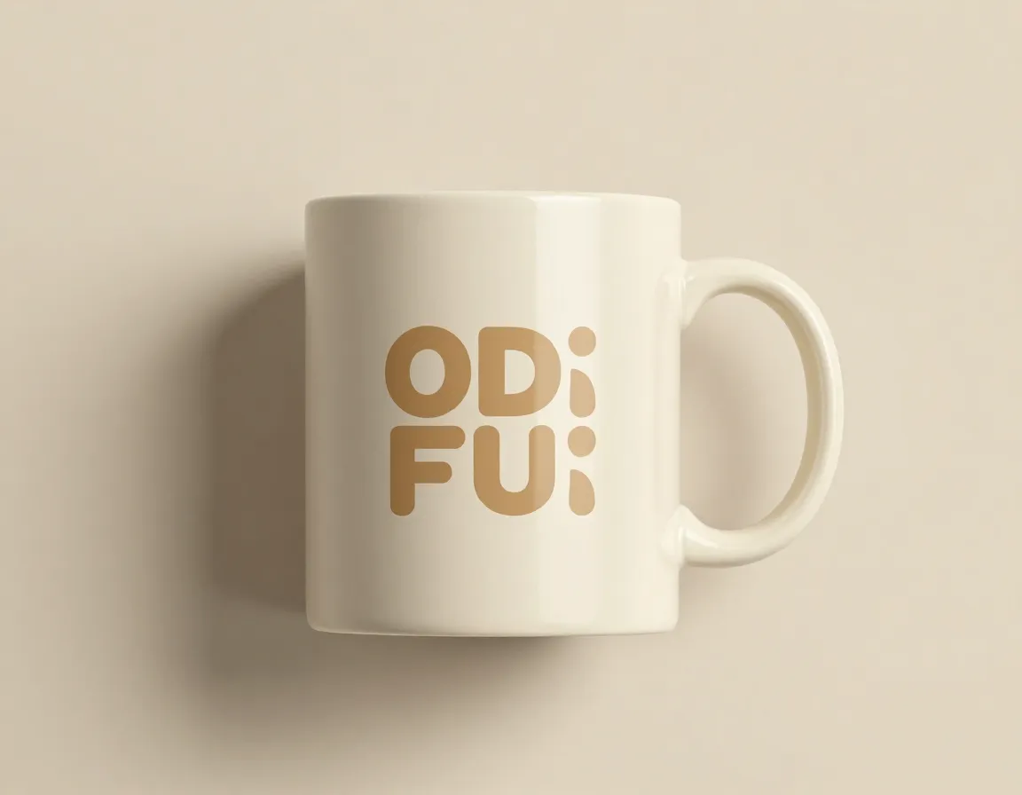
The “toasty logo” styling has emerged as one of the most popular approaches for coffee mug designs in 2026 [3]. This trend emphasizes warmth, comfort, and approachability through specific design elements that create an inviting brand presence.
Rounded letterforms form the cornerstone of toasty logo design. Fonts like Cooper, Söhne Rounded, and Quicksand offer the soft, welcoming appearance that defines this style [3]. These typefaces eliminate sharp edges and harsh angles, creating a sense of friendliness that resonates particularly well on coffee mugs—items associated with comfort and relaxation.
The color palette for toasty logos draws heavily from earthy, calming tones. Popular choices include:
- Oat and cream for subtle, sophisticated backgrounds
- Terracotta and clay pink for warm, inviting accents
- Sage and muted greens for natural, organic feels
- Faded navy for professional yet approachable contrast [3]
Hand-drawn script elements add personality and authenticity to toasty designs. These organic touches suggest craftsmanship and personal attention, qualities that consumers increasingly value in 2026. Consider incorporating subtle hand-lettered elements for taglines or decorative flourishes that complement your main logo.
Organic badges and frames work exceptionally well within the toasty aesthetic. Instead of rigid geometric shapes, opt for flowing, natural forms that echo the rounded typography. These elements can house your logo while adding visual interest and brand distinction.
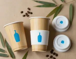
2. Master the “Stamp & Seal” Approach for Instant Recognition
The “stamp & seal” methodology offers one of the most effective ways to create memorable coffee mug logos [3]. This approach focuses on selecting one powerful hero symbol that communicates your brand story quickly and memorably, then framing it within a simple, classic shape.
Choose your hero symbol strategically. The most effective symbols connect directly to your brand’s core value proposition or industry. For example:
- Craft businesses might use tools like shears or hammers
- Agricultural companies could incorporate wheat or leaf motifs
- Travel agencies might feature compass roses or mountain silhouettes
- Tech companies could use geometric patterns or circuit elements [3]
Frame selection matters significantly. Circles provide timeless appeal and work well for logos that need to feel established and trustworthy. Ovals offer a more dynamic feel while maintaining classic sensibilities. Shields suggest protection, reliability, and strength—ideal for security companies or financial services.
Add texture through light etched strokes to give your stamp and seal design depth and sophistication [3]. These subtle details create visual interest without overwhelming the core symbol. The etching effect also translates beautifully to physical mug applications, where raised or recessed elements add tactile appeal.
Company name integration should feel natural and balanced within your chosen frame. Position text along curved paths that follow your frame’s contours, or use clean, horizontal placement that doesn’t compete with your hero symbol for attention.
3. Develop Monogram and Alphabet-Based Designs
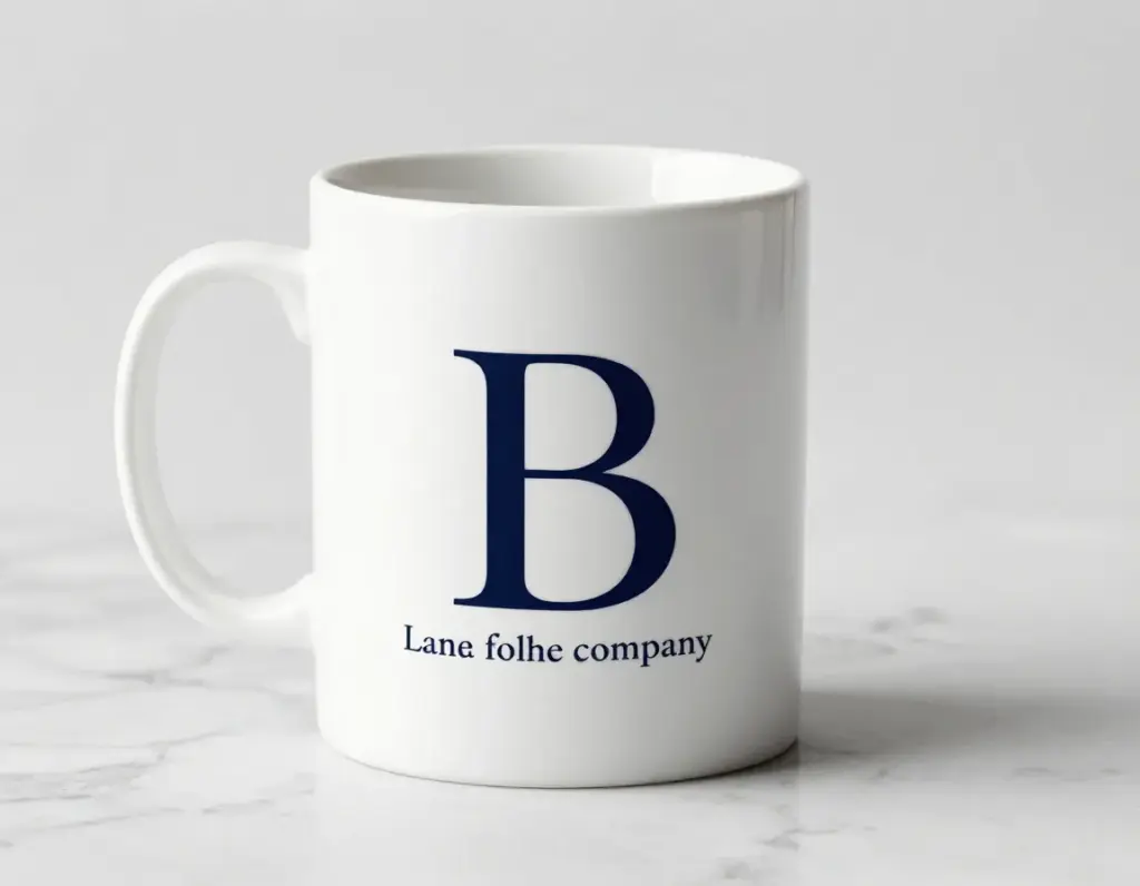
Monogram designs represent a sophisticated approach to coffee mug logos that works particularly well for corporate gifts and professional settings [1]. This strategy leverages the power of typography to create elegant, memorable brand marks that feel both personal and professional.
Serif fonts create refined, traditional appearances that work exceptionally well for established businesses, law firms, consulting agencies, and other professional service providers. The elegant strokes and classical proportions of serif typefaces convey expertise, reliability, and timeless quality [1].
Script letters offer a softer, more approachable aesthetic that suits creative agencies, hospitality businesses, and brands targeting younger demographics. Smooth, flowing script letterforms suggest creativity, personalization, and human touch—qualities that resonate strongly in our increasingly digital world.
Size and proportion considerations become critical with monogram designs. Your primary letter should dominate the design space while maintaining legibility at various scales. Consider how the monogram will appear when printed on different mug sizes and from various viewing distances.
Secondary text integration allows you to include your full company name or tagline without overwhelming the monogram’s impact. Position this supporting text strategically—often below or around the primary letter—using complementary typography that enhances rather than competes with your main design element.
Color application in monogram designs should emphasize contrast and clarity. Single-color applications often work best, allowing the typography’s inherent elegance to shine. When using multiple colors, ensure sufficient contrast for readability across different lighting conditions and mug materials.
4. Incorporate Textured and Raised Pattern Elements
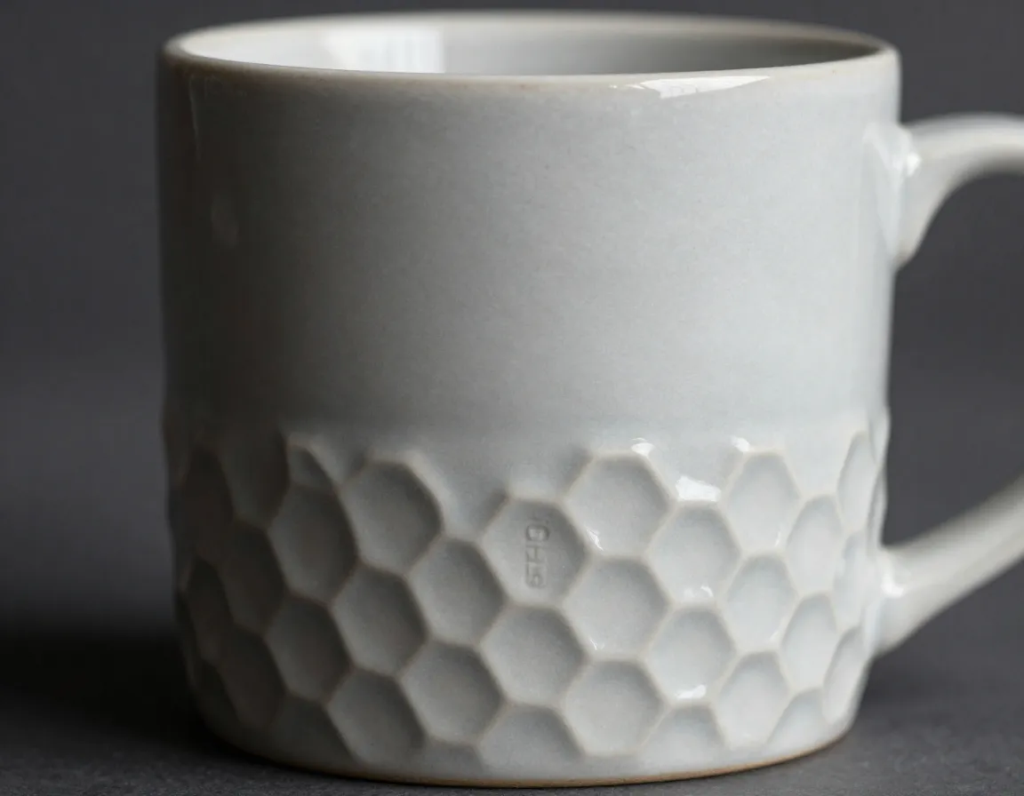
Raised patterns and textured elements have gained significant popularity in 2026, offering a tactile dimension that enhances the user experience [1]. These design approaches create visual interest while adding physical appeal that users can actually feel during use.
Mountain ridge patterns work particularly well for outdoor brands, adventure companies, and businesses that want to convey strength, stability, and natural beauty. These designs can be subtle background elements or prominent focal points, depending on your brand’s personality and target audience.
Carved line effects suggest craftsmanship and attention to detail. These elements work especially well for artisanal brands, craft breweries, and companies that want to emphasize quality and traditional values. The carved aesthetic translates beautifully to physical mug applications, where raised or recessed elements create engaging tactile experiences.
Geometric textures appeal to modern, tech-savvy audiences while maintaining professional appeal. Consider subtle honeycomb patterns, circuit-inspired designs, or abstract geometric arrangements that complement your brand identity without overwhelming your core logo elements.
Implementation considerations vary significantly between different printing methods. UV printing can achieve fine detail in raised elements, while decal applications might require simplified texture approaches [1]. Plan your textured elements with your chosen production method in mind to ensure optimal results.
5. Leverage Strategic Color Psychology and Palettes
Color selection profoundly impacts how your coffee mug logo is perceived and remembered. In 2026, successful brands are moving away from loud gradients and embracing more sophisticated, psychologically-informed color strategies [3].
Earthy warmth palettes create feelings of comfort, reliability, and approachability. These color schemes work exceptionally well for coffee-related businesses, hospitality companies, and brands targeting health-conscious consumers:
| Color | Psychological Impact | Best Applications |
|---|---|---|
| Oat | Calm, sophisticated | Professional services, wellness |
| Clay | Warm, grounded | Artisanal brands, crafts |
| Sage | Natural, balanced | Organic products, sustainability |
| Terracotta | Energetic, creative | Design agencies, restaurants |
Rich nocturnal tones convey luxury, sophistication, and premium quality. Midnight blues, forest greens, and wine burgundies work well for upscale brands, financial services, and companies targeting affluent demographics [3].
Metallic accents should be used sparingly but strategically. Gold and copper tones can elevate designs when applied to specific elements rather than entire logos. These accents work particularly well for highlighting hero symbols or adding elegant finishing touches to typography [3].
Black-and-white testing remains crucial before implementing any color strategy. Your logo must work effectively in single-color applications for receipts, small prints, and cost-effective promotional items [3]. Design in black and white first, then add color strategically to enhance rather than define your logo’s impact.
6. Add Interactive Storytelling and Motivational Text
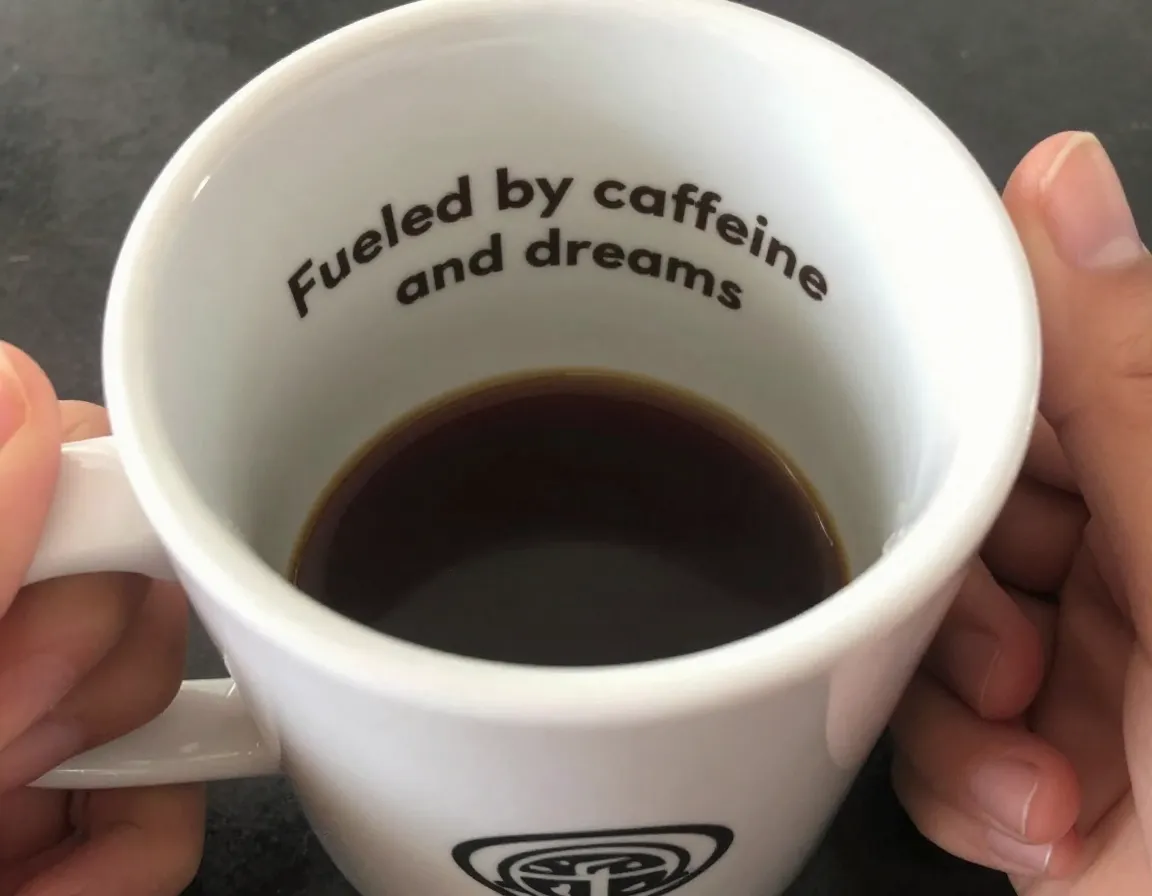
Interactive storytelling elements transform ordinary coffee mugs into daily sources of inspiration and brand connection [4]. This approach goes beyond traditional logo placement to create meaningful experiences that users look forward to each day.
Coffee-related quotes and phrases resonate particularly well with daily mug users. Popular options include:
- “But first, coffee” ☕
- “Espresso yourself!”
- “Life happens, coffee helps”
- “Fueled by caffeine and dreams”
- “Coffee: because adulting is hard” [4]
Brand-specific motivational messages should align with your company values and culture. Tech companies might use phrases like “Code. Coffee. Repeat.” while creative agencies could opt for “Create. Caffeinate. Conquer.” The key is ensuring your messaging feels authentic to your brand personality.
Placement strategies significantly impact the effectiveness of storytelling elements. Consider positioning motivational text on the interior rim, where it becomes visible as users drink. Alternatively, wrap text around the mug’s circumference to create a complete brand experience from every angle.
Typography hierarchy becomes crucial when combining logos with storytelling text. Your primary logo should maintain dominance while supporting text enhances the overall experience. Use contrasting font weights, sizes, or colors to create clear visual hierarchy that guides the user’s attention naturally.
Seasonal and campaign variations allow you to refresh your mug designs regularly while maintaining consistent branding. Consider creating limited-edition versions for holidays, product launches, or company milestones that incorporate special messaging alongside your core logo design.
7. Implement Surrealism and Humor for Memorable Impact
Surrealistic and humorous elements represent an emerging trend that helps brands stand out in increasingly crowded markets [7]. This approach, known as “in-world looking,” brings playful, whimsical concepts to mug designs through unexpected visual elements and clever wordplay.
Visual humor can range from subtle puns to bold, absurd imagery that sparks conversation and creates memorable experiences. Consider how your brand personality aligns with different humor styles:
- Wordplay and puns work well for creative industries and younger demographics
- Visual metaphors can cleverly communicate complex business concepts
- Absurdist elements help tech companies and startups appear more approachable
- Industry-specific jokes create insider connections with professional audiences
Balancing professionalism with playfulness requires careful consideration of your audience and brand positioning. B2B companies might incorporate subtle visual wit, while consumer brands can embrace bolder humorous approaches. The key is ensuring humor enhances rather than undermines your brand credibility.
Surrealistic design elements might include:
- Impossible geometric shapes that challenge perception
- Dreamlike landscapes that incorporate your logo naturally
- Abstract representations of your industry or services
- Unexpected scale relationships that create visual interest
Cultural sensitivity becomes particularly important when incorporating humor into logo designs. What’s funny in one context might be confusing or offensive in another. Test humorous elements with diverse focus groups to ensure broad appeal and appropriate messaging.
Longevity considerations should influence how heavily you lean into humor and surrealism. While these elements can create immediate impact, ensure your design will remain relevant and appropriate as your brand evolves and matures.
8. Optimize for Multiple Printing Methods and Applications
Printing method optimization ensures your logo design translates effectively across different production techniques and budget considerations [1]. Understanding these technical requirements early in the design process prevents costly revisions and ensures consistent brand representation.
UV printing applications offer the highest quality and durability for logo reproduction. This method allows for:
- Fine detail preservation in complex designs
- Vibrant color reproduction across wide palettes
- Excellent adhesion and scratch resistance
- Professional appearance suitable for executive gifts and client presentations [1]
Decal and sticker applications provide faster, more cost-effective alternatives for large-quantity orders or tight timelines. Design considerations for decal printing include:
- Simplified color palettes to reduce production costs
- Bolder line weights that remain visible at small sizes
- Consideration for application surface texture and color
- Planning for potential edge wear over time [1]
Scalability testing ensures your logo works effectively across different mug sizes and viewing distances. Test your design at various scales:
- Large format (12+ ounce mugs with prominent placement)
- Standard format (8-12 ounce mugs with moderate sizing)
- Small format (espresso cups and promotional mini mugs)
- Extreme reduction (business card or letterhead applications)
Material considerations affect how your logo appears on different mug types. Ceramic surfaces offer the best color reproduction and detail retention, while metal mugs might require adjusted contrast ratios. Plastic promotional mugs often need simplified designs with higher contrast for optimal visibility.
Quality control standards should be established before production begins. Define acceptable tolerances for color matching, registration accuracy, and detail reproduction. Having clear standards prevents disputes and ensures consistent brand representation across all produced items.
Advanced Implementation Strategies
Corporate customization templates allow you to maintain brand consistency while offering personalization options for different departments, events, or client gifts [2]. Create flexible design systems that incorporate your core logo while allowing for variable text, colors, or supplementary graphics.
Seasonal adaptation strategies help keep your branded mugs relevant throughout the year. Consider how your logo design can accommodate holiday themes, company milestones, or seasonal color variations without losing brand recognition or impact.
Employee engagement considerations should influence your design choices, especially for internal corporate gifts. Designs that employees genuinely enjoy using at home extend your brand’s reach and create positive associations with company culture.
Client gift positioning requires balancing your branding needs with recipient preferences. Executive gifts might call for more subtle, sophisticated logo applications, while promotional items can embrace bolder, more prominent branding approaches.
Measurement and feedback systems help you evaluate the effectiveness of your mug logo designs over time. Track metrics like employee usage rates, client feedback, and brand recognition to inform future design iterations and improvements.
Conclusion
The 8 creative ways to design a coffee mug logo for your brand we’ve explored represent the cutting edge of promotional design in 2026. From embracing toasty typography and stamp-and-seal approaches to incorporating interactive storytelling and optimizing for multiple printing methods, these strategies provide a comprehensive toolkit for creating memorable, effective brand experiences.
Your next steps should begin with evaluating your current brand identity and target audience preferences. Choose 2-3 approaches from this guide that align most closely with your brand personality and business objectives. Remember that the most effective mug logos prioritize clarity and authenticity over complexity and perfection.
Start with black-and-white designs to ensure your core concept works across all applications, then layer in color and texture strategically. Test your designs with real users and gather feedback before committing to large production runs. Most importantly, ensure your final design creates genuine emotional connections that make people want to reach for your branded mug every morning.
The investment you make in thoughtful, strategic mug logo design will pay dividends through increased brand recognition, improved employee engagement, and stronger client relationships. In a world where digital interactions dominate, these physical touchpoints become even more valuable for creating lasting brand impressions.
References
[1] Mug Design Ideas – https://www.eufymake.com/blogs/printing-ideas/mug-design-ideas
[2] 2026 Calendar Business Logo Corporate Office Gift Coffee Mug 256161302746929117 – https://www.zazzle.com/2026_calendar_business_logo_corporate_office_gift_coffee_mug-256161302746929117
[3] Logo Design Trends – https://www.vistaprint.com/hub/logo-design-trends
[4] Best Mug Design Ideas – https://dynamicmockups.com/mug/best-mug-design-ideas/
[5] Logo Design Trends – https://www.logomaker.com/blog/logo-design-trends/
[6] Custom Drinkware Trends For Corporate Branding – https://swag.com/blog/custom-drinkware-trends-for-corporate-branding
[7] Drinkware Design Trends – https://www.printful.com/blog/drinkware-design-trends
[8] 99designs – https://99designs.com/inspiration/branding/cup