8 Coffee Business Logo Design Tips That Perk Up Your Brand
Picture this: a customer walks past dozens of coffee shops, but only one logo catches their eye and draws them inside. That’s the power of exceptional coffee logo design. In 2026’s competitive coffee market, your logo isn’t just a pretty picture—it’s your brand’s first impression, your silent salesperson, and your ticket to customer recognition.
I’ve seen countless coffee businesses struggle with generic, forgettable logos that blend into the background noise of the industry. But here’s the truth: 8 Coffee Business Logo Design Tips That Perk Up Your Brand can transform your visual identity from ordinary to extraordinary, helping you stand out in a crowded marketplace and build lasting customer loyalty.
Key Takeaways
- Simplicity beats complexity: Clean, memorable designs outperform cluttered logos every time
- Warmth and approachability: Use rounded fonts, earthy colors, and hand-drawn elements to create inviting brand experiences
- Versatility is crucial: Your logo must work perfectly across all applications, from tiny app icons to large storefront signs
- Test in real contexts: Evaluate your design where customers actually see it—packaging, social media, and signage
- Balance uniqueness with trust: Make one or two distinctive design choices rather than trying to be different in every element
Understanding Coffee Logo Design Fundamentals
1. Prioritize Simplicity and Clarity Over Perfection
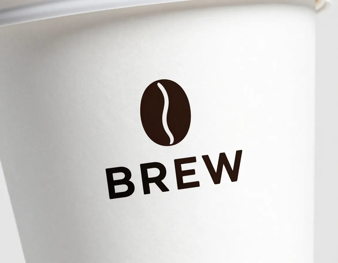
The first of our 8 Coffee Business Logo Design Tips That Perk Up Your Brand focuses on a fundamental principle that many coffee businesses get wrong: simplicity trumps complexity every single time.
Effective coffee logos emphasize clear, simple designs that are unmistakably you rather than perfect, generic designs [2]. When I work with coffee shop owners, I often see them trying to cram every coffee-related element into their logo—beans, cups, steam, leaves, and more. The result? A cluttered mess that customers can’t remember or recognize from a distance.
Instead, focus on these simplicity principles:
- Choose one primary visual element (coffee bean, cup, or abstract symbol)
- Limit your color palette to 2-3 colors maximum
- Use clean typography that’s easily readable at any size
- Remove unnecessary details that don’t serve your brand story
Consider how Starbucks evolved their logo over decades, gradually removing text and simplifying their iconic siren to create a more memorable, versatile design [3]. This evolution demonstrates how simplicity enhances brand recognition rather than diminishing it.
“The best logos tell a story in the simplest way possible. Your coffee logo should communicate your brand’s personality in a single glance.”
2. Embrace “Toasty Logo” Aesthetics for Warmth

The second tip in our 8 Coffee Business Logo Design Tips That Perk Up Your Brand involves adopting what designers call “toasty logos”—designs that radiate warmth and approachability.
Use rounded letterforms, soft curves, hand-drawn scripts, and organic badges with earthy colors to create welcoming, inviting aesthetics ideal for cafés [2]. This approach works because coffee is fundamentally about comfort, community, and warmth.
Here’s how to implement toasty logo elements:
Typography Choices:
- Cooper (classic, friendly curves)
- Söhne Rounded (modern, approachable)
- Quicksand (clean, soft edges)
- Custom hand-lettered scripts
Visual Elements:
- Soft, rounded corners instead of sharp edges
- Organic shapes that feel natural and handmade
- Gentle curves that guide the eye smoothly
- Badge-style designs with subtle borders
Color Psychology:
- Oat and cream: Creates feelings of comfort and nourishment
- Terracotta and clay pink: Evokes warmth and earthiness
- Sage green: Suggests natural, organic qualities
- Faded navy: Provides sophistication without coldness
These design choices subconsciously communicate that your coffee shop is a place where customers can relax, connect, and feel at home.
Color Strategy and Visual Elements
3. Master Earthy and Calming Color Palettes
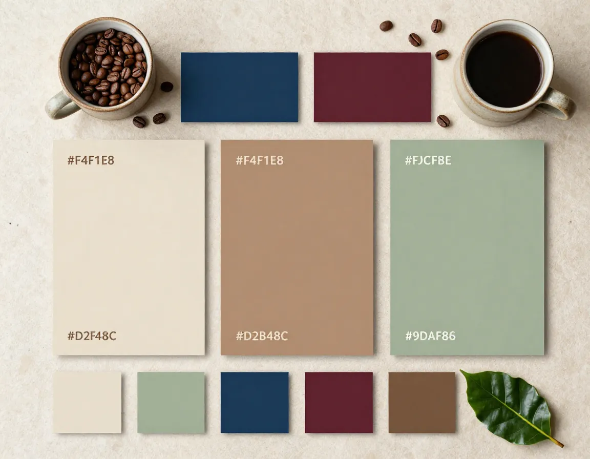
Color selection represents a crucial element among our 8 Coffee Business Logo Design Tips That Perk Up Your Brand. The right color palette can instantly communicate your brand’s personality and values to potential customers.
Leading color choices include earthy warmth, rich nocturnals, and restrained metallic accents rather than bold gradients [2]. Let me break down the most effective color strategies for coffee businesses:
Earthy Warmth Palette:
- Primary: Oat (#F4F1E8), Clay (#D2B48C), Sage (#9CAF88)
- Best for: Organic coffee shops, artisanal roasters, community-focused cafés
- Psychology: Conveys naturalness, sustainability, and comfort
Rich Nocturnal Palette:
- Primary: Midnight (#2C3E50), Forest (#355E3B), Wine (#722F37)
- Best for: Premium coffee brands, evening coffee bars, sophisticated roasters
- Psychology: Suggests luxury, depth, and expertise
Metallic Accent Strategy:
- Gold accents: Premium positioning, luxury appeal
- Copper touches: Artisanal quality, warmth
- Bronze highlights: Heritage, craftsmanship
| Color Category | Primary Colors | Brand Personality | Best Applications |
|---|---|---|---|
| Earthy Warmth | Oat, Clay, Sage | Approachable, Natural | Community cafés, Organic brands |
| Rich Nocturnal | Midnight, Forest, Wine | Sophisticated, Premium | Upscale coffee bars, Specialty roasters |
| Metallic Accents | Gold, Copper, Bronze | Luxurious, Artisanal | Premium products, Heritage brands |
4. Incorporate Tactile, Human-Made Elements
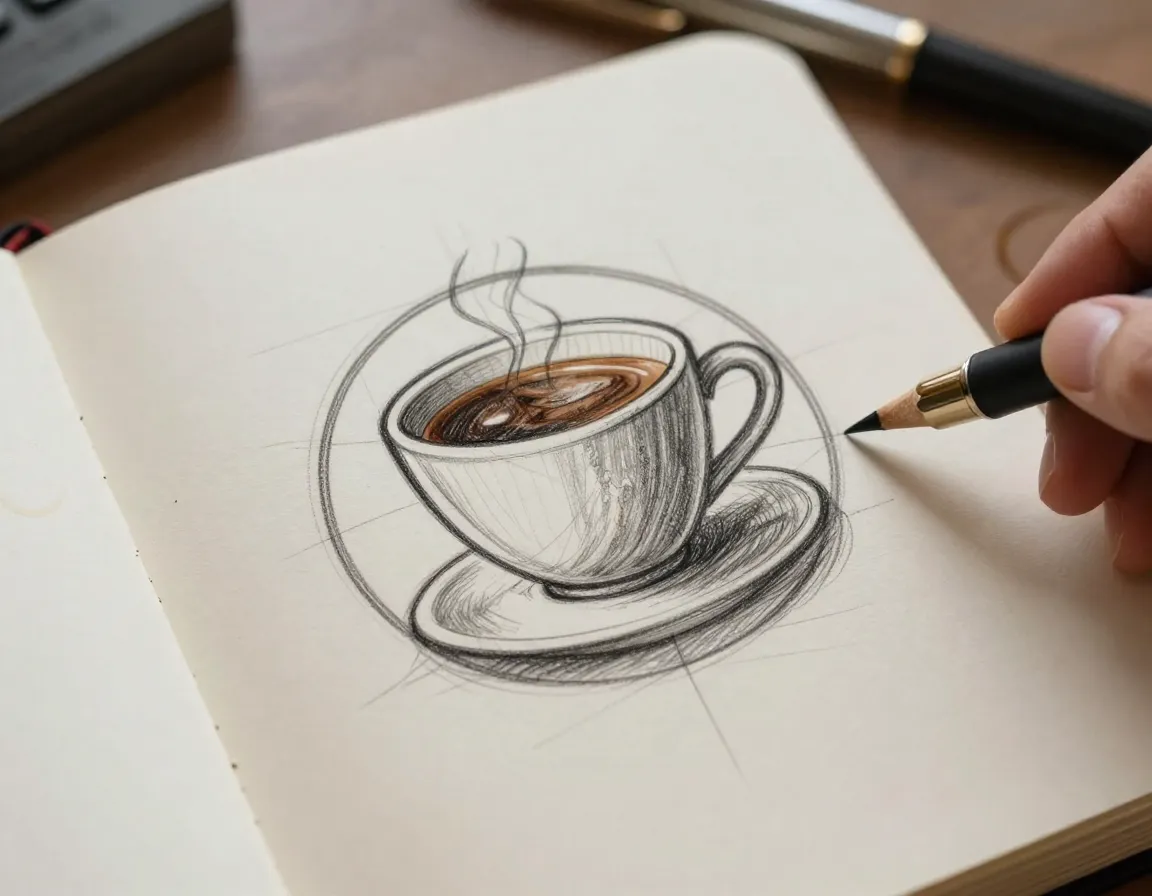
The fourth tip in our 8 Coffee Business Logo Design Tips That Perk Up Your Brand focuses on adding authenticity through tactile design elements that feel genuinely human-crafted.
Hand-drawn curves, engraving lines, light textures, and tiny quirks signal realness and intent, contrasting with generic AI-generated designs [2]. In 2026’s increasingly digital world, customers crave authentic, human connections—and your logo can provide that through thoughtful design details.
Effective Human-Made Elements:
🎨 Hand-Drawn Components:
- Slightly imperfect circles and curves
- Variable line weights that mimic pen strokes
- Custom lettering with personality quirks
- Organic shapes that feel sketched rather than computer-generated
✏️ Textural Details:
- Paper grain backgrounds for vintage appeal
- Pencil speckle effects for artistic authenticity
- Subtle halftone patterns reminiscent of old printing
- Gentle noise overlays that add character
🖋️ Engraving-Style Elements:
- Fine line work that suggests craftsmanship
- Cross-hatching patterns for depth and texture
- Vintage-inspired borders and flourishes
- Detailed illustrations that reward close examination
These elements work because they tell customers that real people, with real passion for coffee, created your brand. They suggest attention to detail, care in preparation, and a commitment to quality that extends from your logo to your coffee.
Versatility and Application Testing
5. Ensure Cross-Platform Versatility
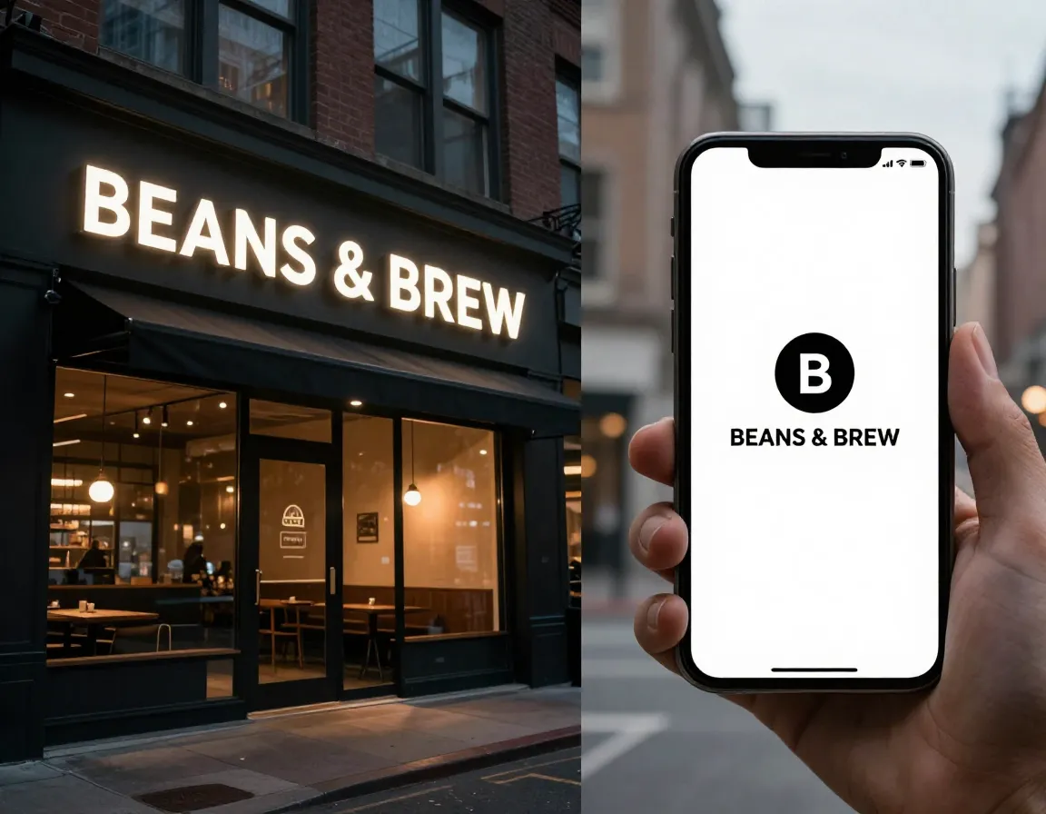
Versatility stands as a cornerstone among our 8 Coffee Business Logo Design Tips That Perk Up Your Brand. Your logo must perform flawlessly across every customer touchpoint, from massive storefront signs to tiny social media profile pictures.
Successful coffee logos work across all media with clean, professional designs that maintain recognition on signs, labels, receipts, and small prints [3]. I’ve witnessed too many coffee businesses create beautiful logos that fall apart when scaled down or lose impact when printed in black and white.
Essential Versatility Requirements:
📱 Digital Applications:
- Website headers and favicons
- Social media profile pictures and cover images
- Mobile app icons (as small as 16×16 pixels)
- Email signatures and digital receipts
- Online ordering platforms and delivery apps
🏪 Physical Applications:
- Storefront signage (large scale visibility)
- Coffee cup sleeves and packaging
- Business cards and promotional materials
- Uniforms and merchandise
- Point-of-sale displays and menu boards
Testing Checklist:
- ✅ Readable at 1-inch width
- ✅ Clear in black and white printing
- ✅ Recognizable without color
- ✅ Scalable to billboard size
- ✅ Functional as a social media avatar
Consider creating multiple logo variations to ensure optimal performance:
- Primary logo: Full version with text and icon
- Secondary mark: Icon-only version for small applications
- Horizontal layout: For wide spaces like website headers
- Stacked version: For square or vertical applications
6. Add Character Through Simple Illustrations
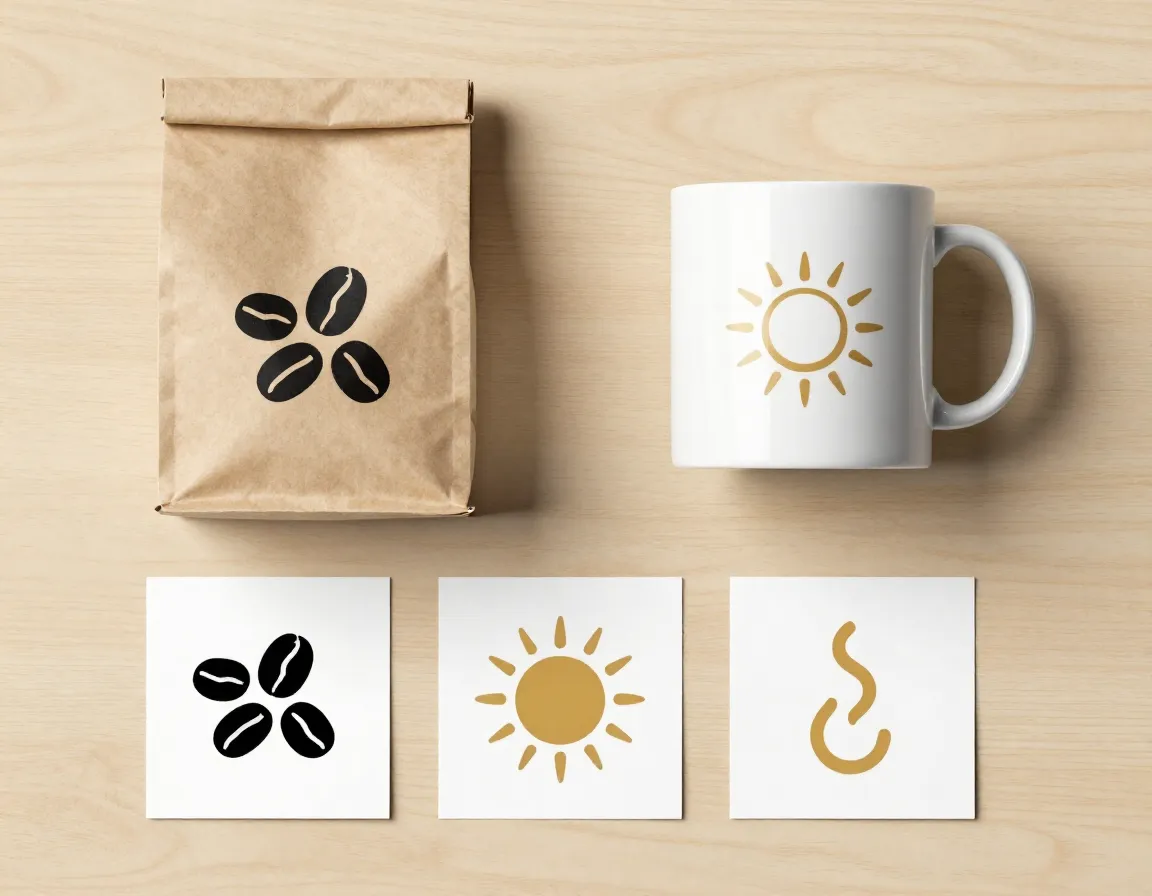
The sixth element of our 8 Coffee Business Logo Design Tips That Perk Up Your Brand involves creating supporting visual elements that enhance your main logo without overwhelming it.
Build alternate marks like sprigs, mugs, or smiley suns as supporting elements tested on kraft labels and white backgrounds [2]. These additional elements give you flexibility in your branding while maintaining consistency across all applications.
Effective Supporting Elements:
☕ Coffee-Related Icons:
- Minimalist coffee bean clusters
- Simple steam wisps or aroma lines
- Geometric coffee cup silhouettes
- Abstract representations of coffee plants
🌿 Natural Elements:
- Small botanical sprigs or leaves
- Simple sun or sunrise symbols
- Geometric mountain or landscape shapes
- Minimalist tree or plant illustrations
Implementation Strategy:
- Create a cohesive family of 3-5 supporting marks
- Test each element on different background colors
- Ensure scalability from large posters to small labels
- Maintain style consistency with your primary logo
- Document usage guidelines for consistent application
These supporting elements serve multiple purposes:
- Enhance brand recognition through repeated visual cues
- Provide layout flexibility for different design needs
- Create visual interest in packaging and marketing materials
- Build brand equity through consistent visual language
Remember to keep these illustrations simple and purposeful. Each element should feel like a natural extension of your main logo rather than a separate design trying to compete for attention.
Real-World Testing and Implementation
7. Test Designs in Authentic Customer Contexts

The seventh principle among our 8 Coffee Business Logo Design Tips That Perk Up Your Brand emphasizes the critical importance of real-world testing before finalizing your design decisions.
Evaluate logos on the specific places customers actually encounter them: signage, labels, Instagram, invoices, business cards, and packaging [2]. Too many coffee businesses make the mistake of perfecting their logo in isolation, only to discover it doesn’t work in actual customer touchpoints.
Comprehensive Testing Framework:
🏪 Physical Locations:
- Print your logo on actual coffee cup sleeves
- Create mockup storefront signage at real viewing distances
- Test visibility from across the street and from passing cars
- Evaluate readability in different lighting conditions (morning, evening, indoor)
📱 Digital Environments:
- Upload to Instagram as profile picture and story highlights
- Test as website favicon in browser tabs
- Create email signature mockups
- Design social media post templates
📦 Packaging Applications:
- Print on kraft paper bags and white packaging
- Test on different colored backgrounds
- Evaluate at various sizes on labels and stickers
- Consider how it looks when printed in single color
Real-World Testing Questions:
- Can customers recognize your logo from 50 feet away?
- Does it remain clear when printed on textured surfaces?
- Is it legible in poor lighting conditions?
- Does it work when faxed or photocopied?
- Can elderly customers with vision challenges read it easily?
Documentation Process:
Create a simple testing log to track performance across different applications. Note any issues with readability, color reproduction, or visual impact. This systematic approach ensures your final logo performs excellently in every customer interaction.
8. Balance Legacy Appeal with Distinctive Character
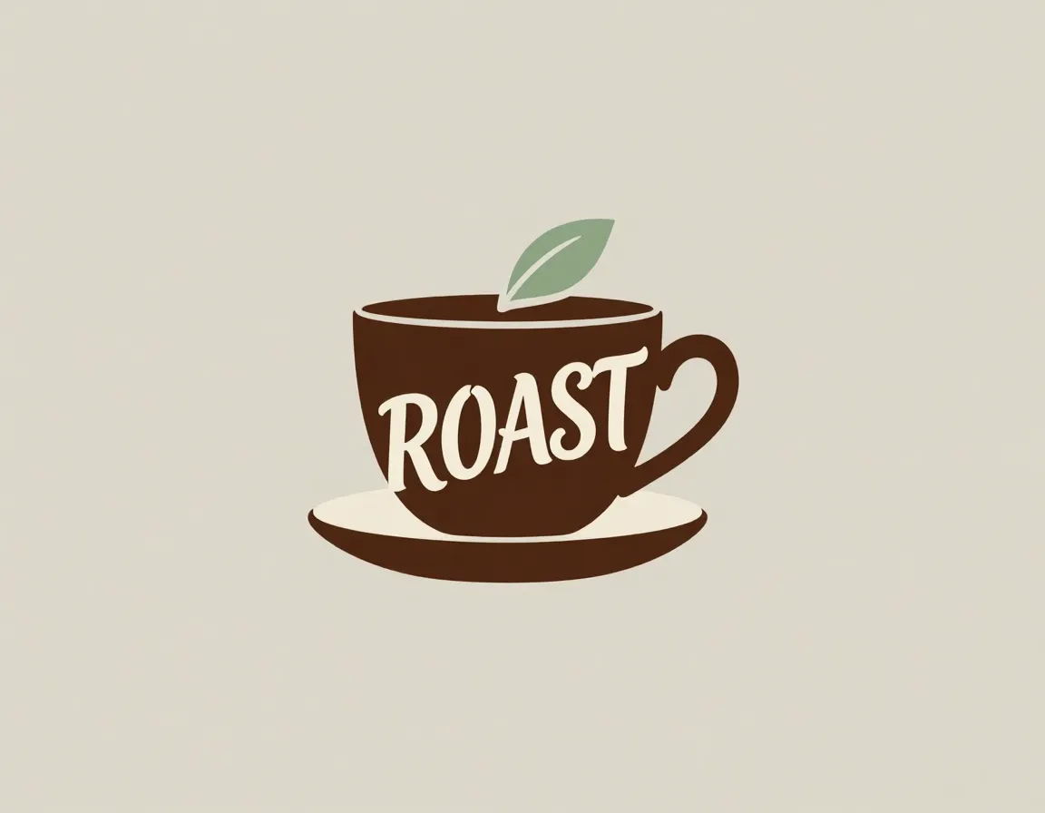
The final tip in our 8 Coffee Business Logo Design Tips That Perk Up Your Brand focuses on achieving the delicate balance between trustworthiness and uniqueness that successful coffee brands require.
Use one or two design choices that only your business would make rather than 20 variations, communicating care and authenticity [2]. This principle prevents your logo from becoming either too generic or too eccentric for your target market.
Strategic Differentiation Approach:
🎯 Choose Your Unique Elements Carefully:
- Typography: Select one distinctive font that reflects your personality
- Color combination: Use an unexpected but harmonious color pairing
- Symbol style: Develop a unique illustration approach or geometric pattern
- Layout: Create a memorable arrangement of text and imagery
Legacy and Trust Builders:
- Classic typography with a modern twist
- Traditional coffee imagery rendered in your unique style
- Time-tested color combinations with fresh proportions
- Heritage-inspired elements updated for contemporary appeal
Successful Balance Examples:
- A traditional coffee cup silhouette rendered in minimalist line art
- Classic serif typography paired with an unexpected accent color
- Vintage badge styling with contemporary, clean typography
- Traditional coffee plant imagery simplified into geometric shapes
Implementation Guidelines:
| Element | Traditional Approach | Distinctive Twist | Result |
|---|---|---|---|
| Typography | Standard serif font | Custom hand-lettered accent | Familiar yet unique |
| Color | Brown and cream | Add unexpected sage green | Fresh but coffee-appropriate |
| Symbol | Coffee bean cluster | Geometric, angular interpretation | Modern yet recognizable |
| Layout | Centered, symmetrical | Slightly off-center balance | Dynamic but stable |
Remember: distinctiveness doesn’t mean being different for the sake of being different. Your unique elements should reinforce your brand story and appeal to your specific customer base while maintaining the trust and familiarity that coffee customers expect.
The most successful coffee logos make customers think, “This feels both familiar and special—exactly what I want in my coffee experience.”
Conclusion
Implementing these 8 Coffee Business Logo Design Tips That Perk Up Your Brand will transform your coffee business from just another café into a memorable brand that customers actively seek out and recommend to friends.
Remember the core principles: prioritize simplicity over complexity, embrace warmth through toasty design elements, choose earthy color palettes that evoke comfort, incorporate authentic human-made touches, ensure versatility across all applications, add character through thoughtful illustrations, test extensively in real-world contexts, and balance uniqueness with trustworthiness.
Your next steps:
- Audit your current logo against these eight principles
- Identify 2-3 areas where your design could improve
- Create mockups testing your logo in actual customer touchpoints
- Gather feedback from real customers in your target demographic
- Refine and implement your improved design systematically across all brand applications
Your logo is more than just a visual mark—it’s the foundation of customer relationships that will fuel your coffee business’s growth for years to come. Take the time to get it right, and watch as your thoughtfully designed brand identity attracts the loyal customers every coffee business dreams of serving.
Start implementing these tips today, and give your coffee brand the visual identity it deserves to thrive in 2026’s competitive marketplace. ☕
References
[1] Coffee – https://www.designrush.com/best-designs/logo/coffee
[2] Logo Design Trends – https://www.vistaprint.com/hub/logo-design-trends
[3] Best Coffee Logos – https://www.logocrafter.app/blog/best-coffee-logos
[4] Coffee%20logo – https://www.behance.net/search/projects/coffee%20logo?locale=en_US
[5] Coffee – https://masterbundles.com/graphics/logos/food/coffee/
[6] Coffee Shop – https://99designs.com/inspiration/branding/coffee-shop
[7] Top Logo Design Trends 2026 – https://www.logomaker.com/blog/tag/top-logo-design-trends-2026/
[8] Coffee – https://www.designhill.com/i/logo+ideas+inspiration/coffee/


